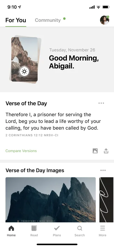
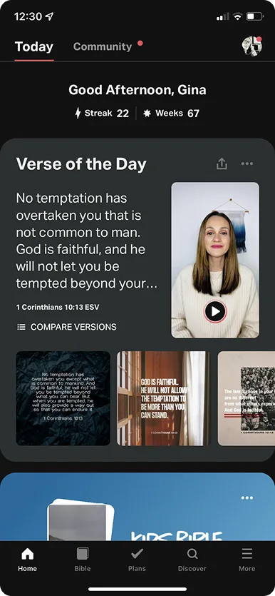
Today View
& Plans.
Redesigning the daily entry point for one of the world's most-used Bible apps. The goal wasn't features, it was habit. Making showing up feel effortless, personal, and worth doing again tomorrow.
I led end-to-end design for this feature as the sole designer — user research, wireframes, and final production design — working alongside 1 PM and the engineering team from problem definition through launch.
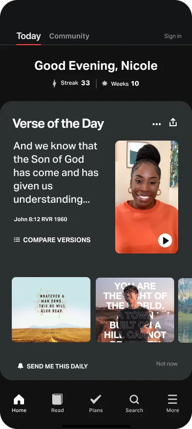
1B+ installs. The challenge was getting people to come back.
Three things drove return: streaks, emotional relevance, and low-friction entry points. Everything in this redesign maps to one of those three.
Explorations.
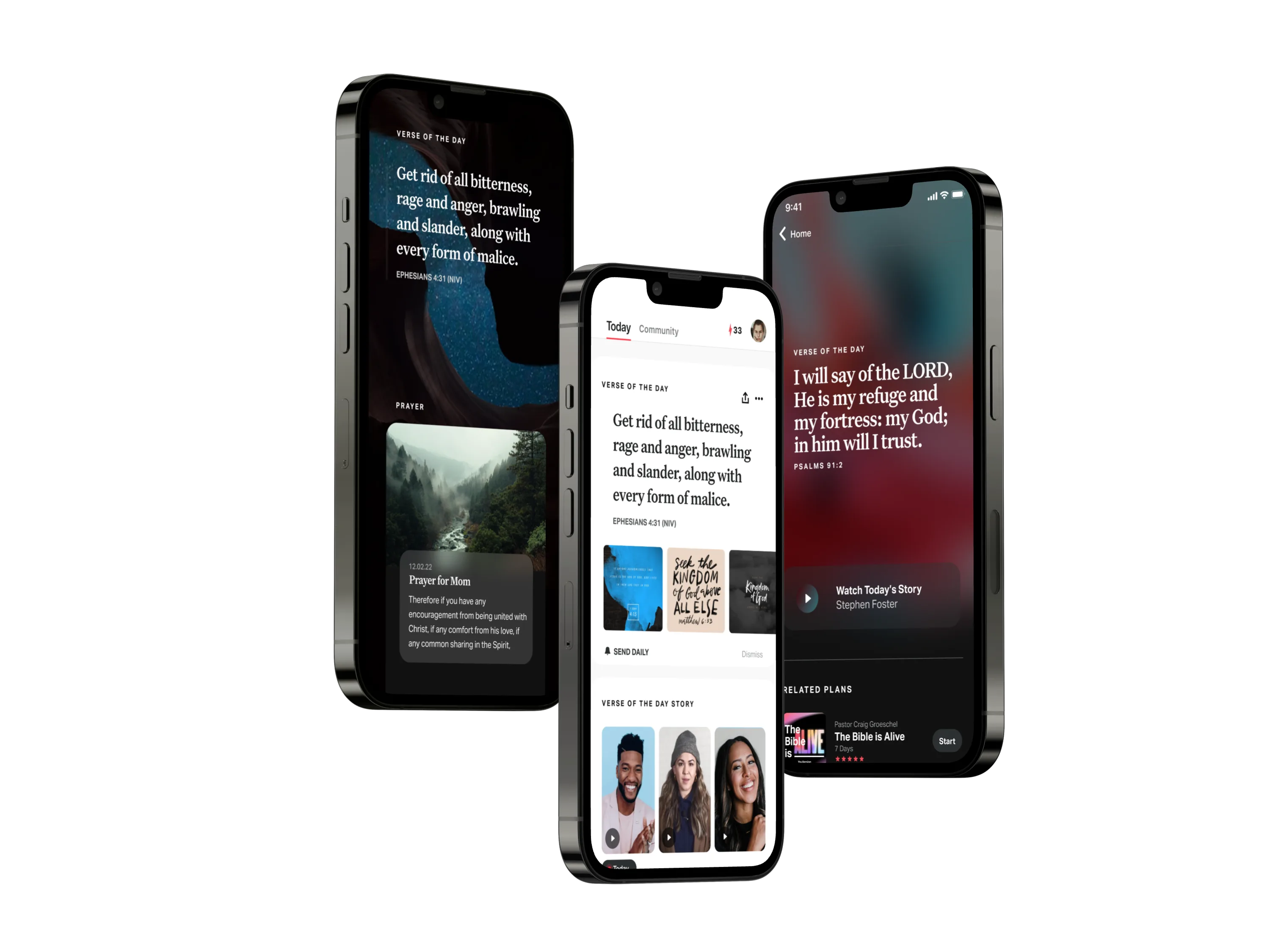
Left to right: immersive full-screen verse · light, editorial layout with speaker stories · focused single verse with video devotional
What shipped.
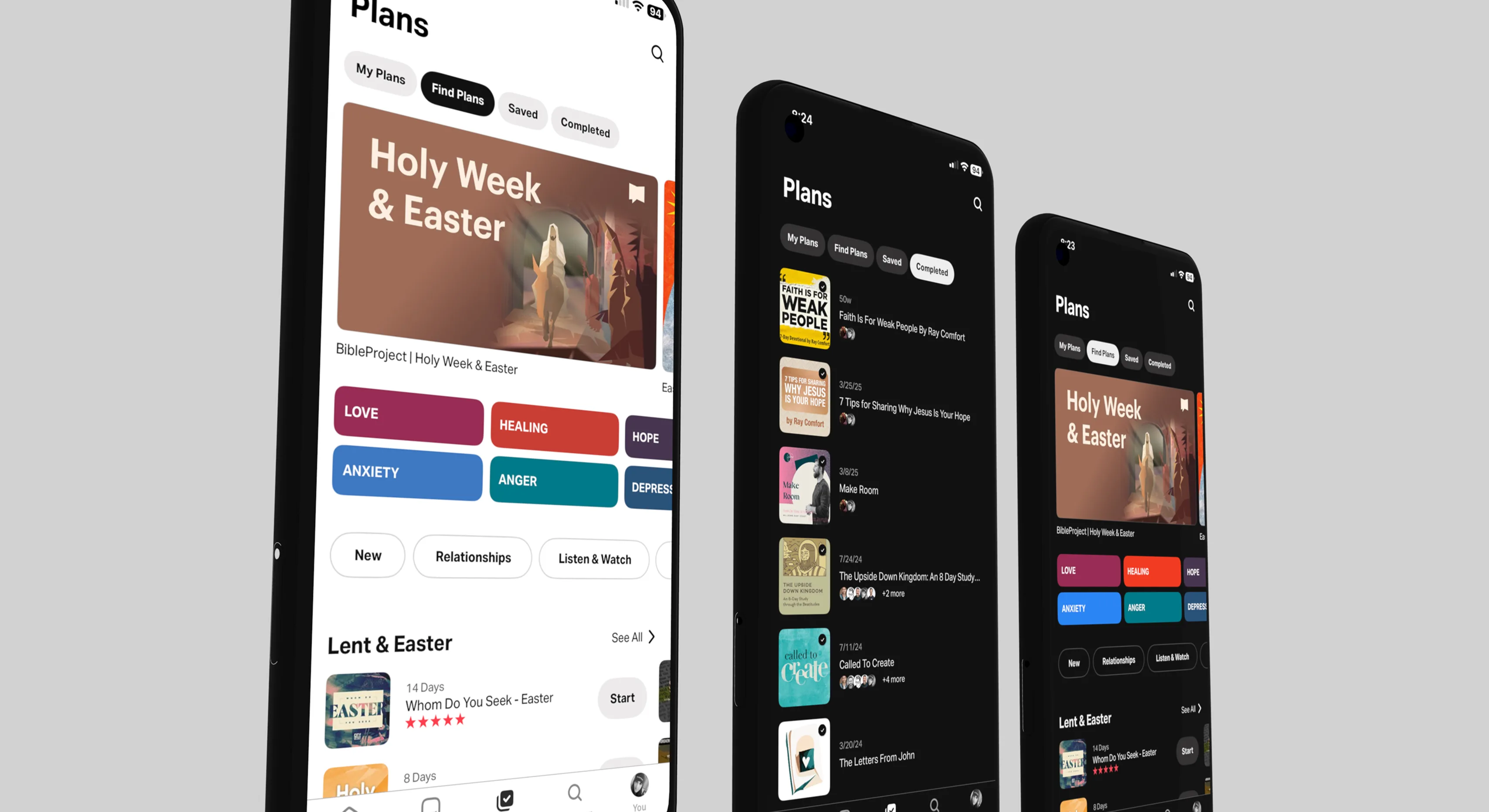
- Streak reinforcement front and center.
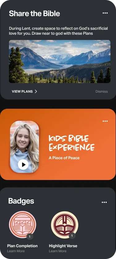
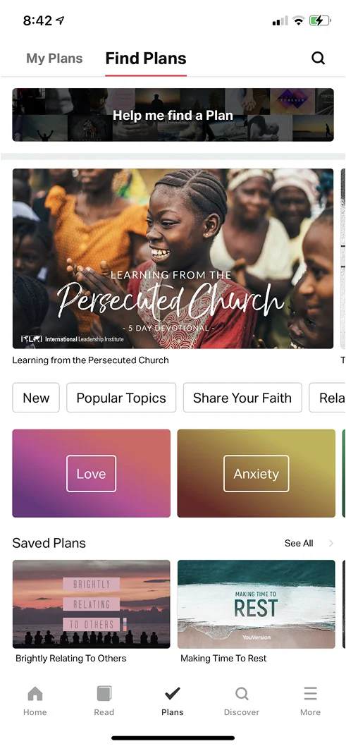
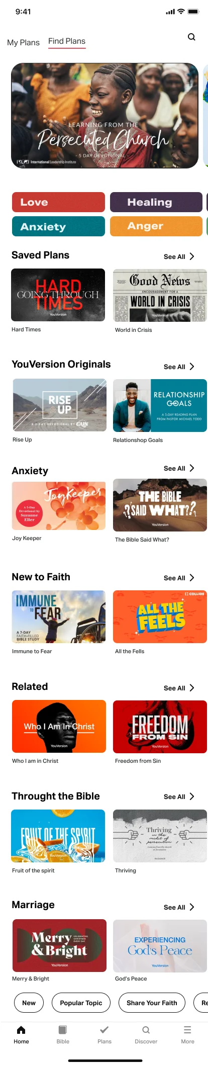
- Emotion-based Plan discovery.
- Speaker thumbnail instead of verse image — 50% more taps.
Production screens · YouVersion Bible App · Today View & Plans
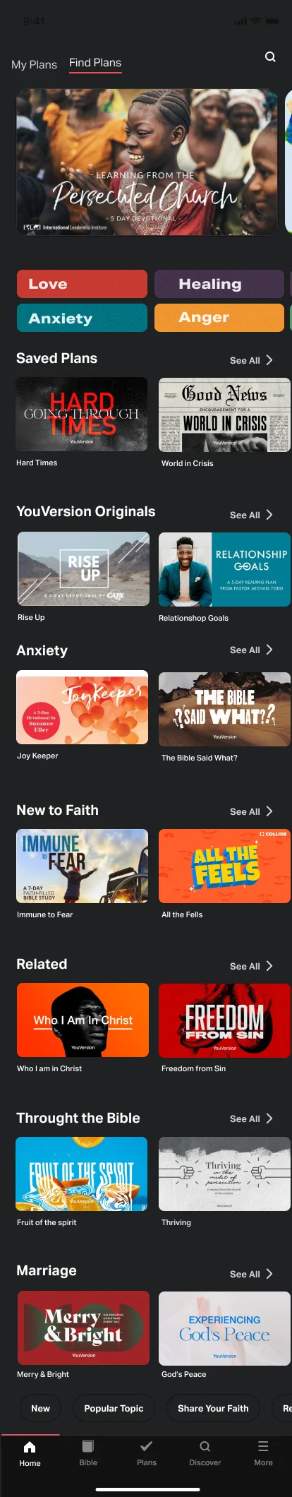
Plans redesign.
Before
Redesign · Light
Outcome
Video engagement up nearly 50%. Plans built a deeper habit.
Searching by feeling became one of the most used paths into content. Users don't open the app thinking "I want a 7-day plan." They open it anxious, hopeful, or lost — and this redesign met them there.
Next release: active, search, and saved plans — in one gesture.