Bible App Lite.
Designing a Bible app for people where connectivity is a luxury, not a given. Where the Bible itself can feel intimidating. Every tap, every kilobyte, and every illustration had to say: you are welcome here.
Designing for people where connectivity is a luxury.
37% of the global population uses older devices, has limited storage, and no guarantee of a data connection. The full Bible App wasn't built for them. Bible App Lite was.
When every tap has to count.
- Offline download-first architecture.
- Eliminated progressive loading patterns.
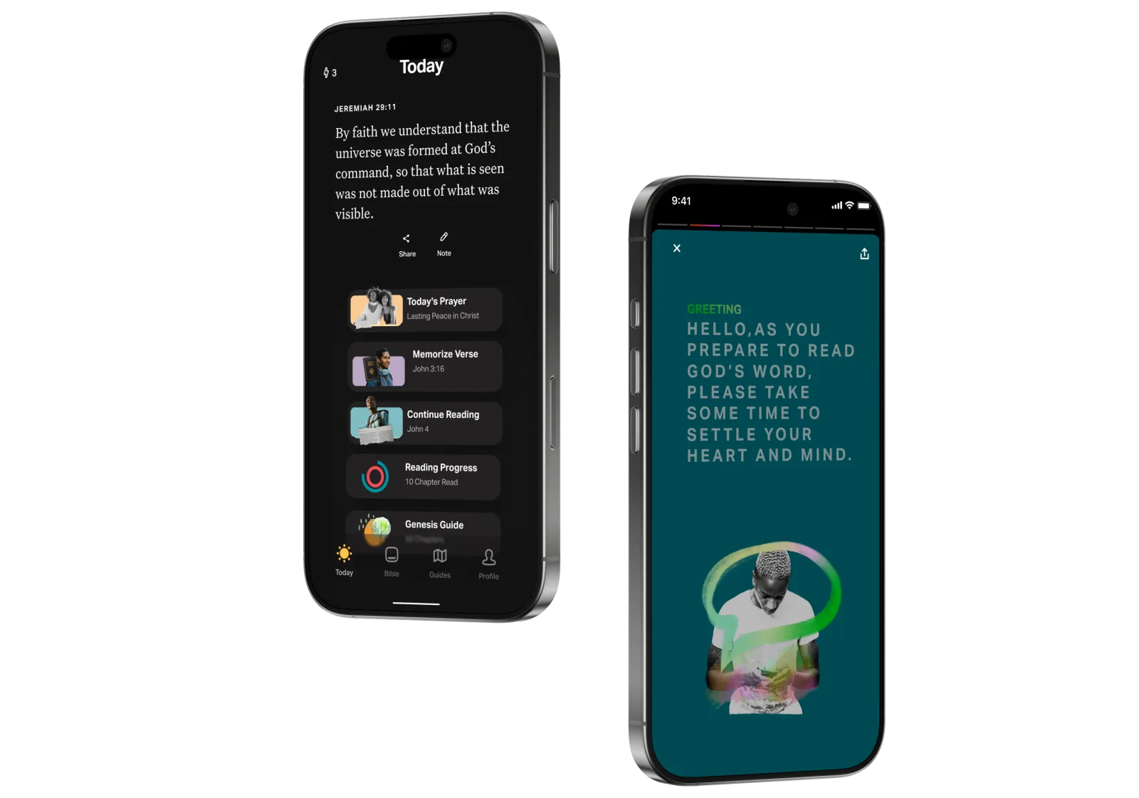
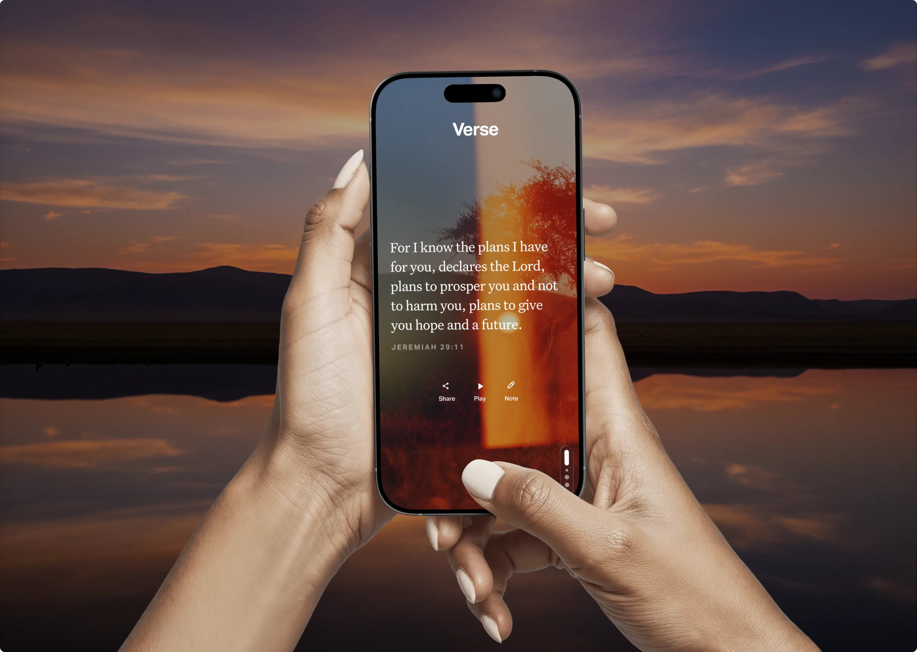
- Navigation reduced to three surfaces: Read, Listen, Pray.
- Verse of the Day as the single daily anchor.
Illustrations that look like the people using it.
AI-assisted, hand-refined in Illustrator. Tested three styles with real users in Africa, South America, and Latin America. They chose the most human direction, not the most polished.
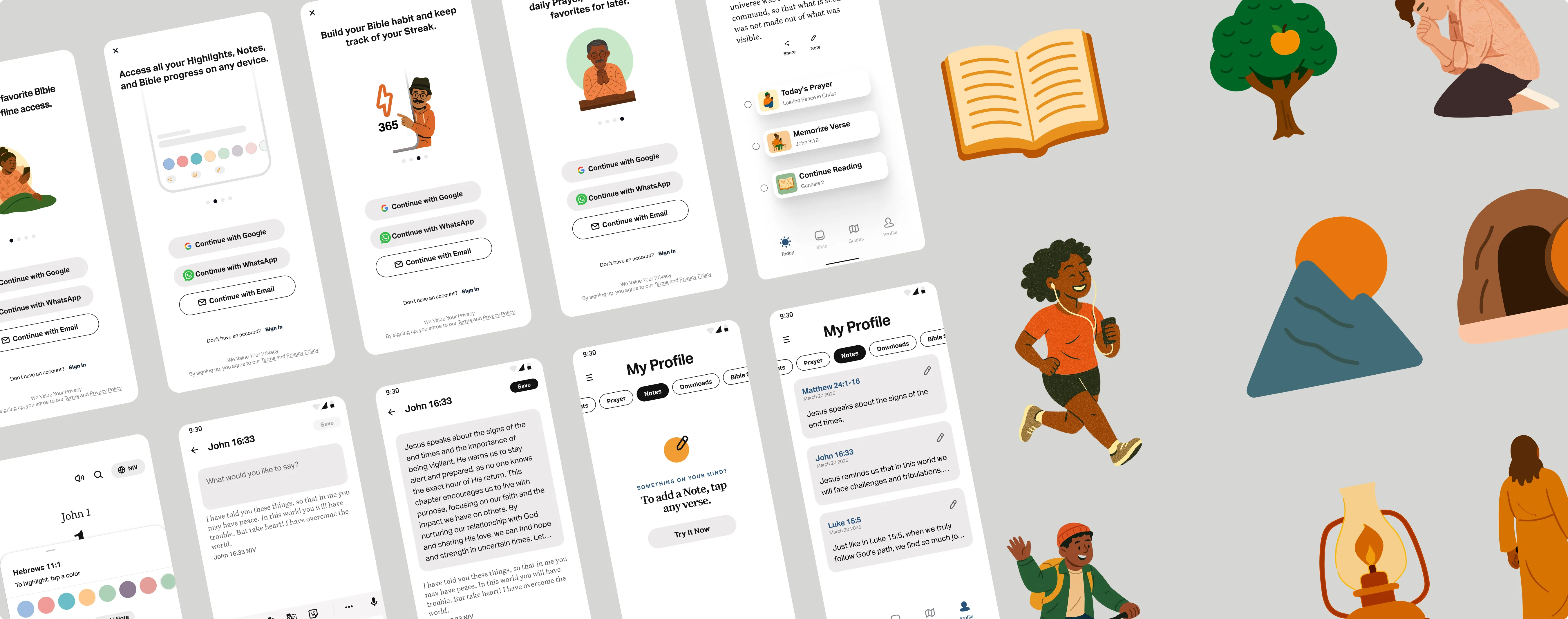
UI system and illustration library. Built light, built to last.
Scripture memorization that feels like a game.
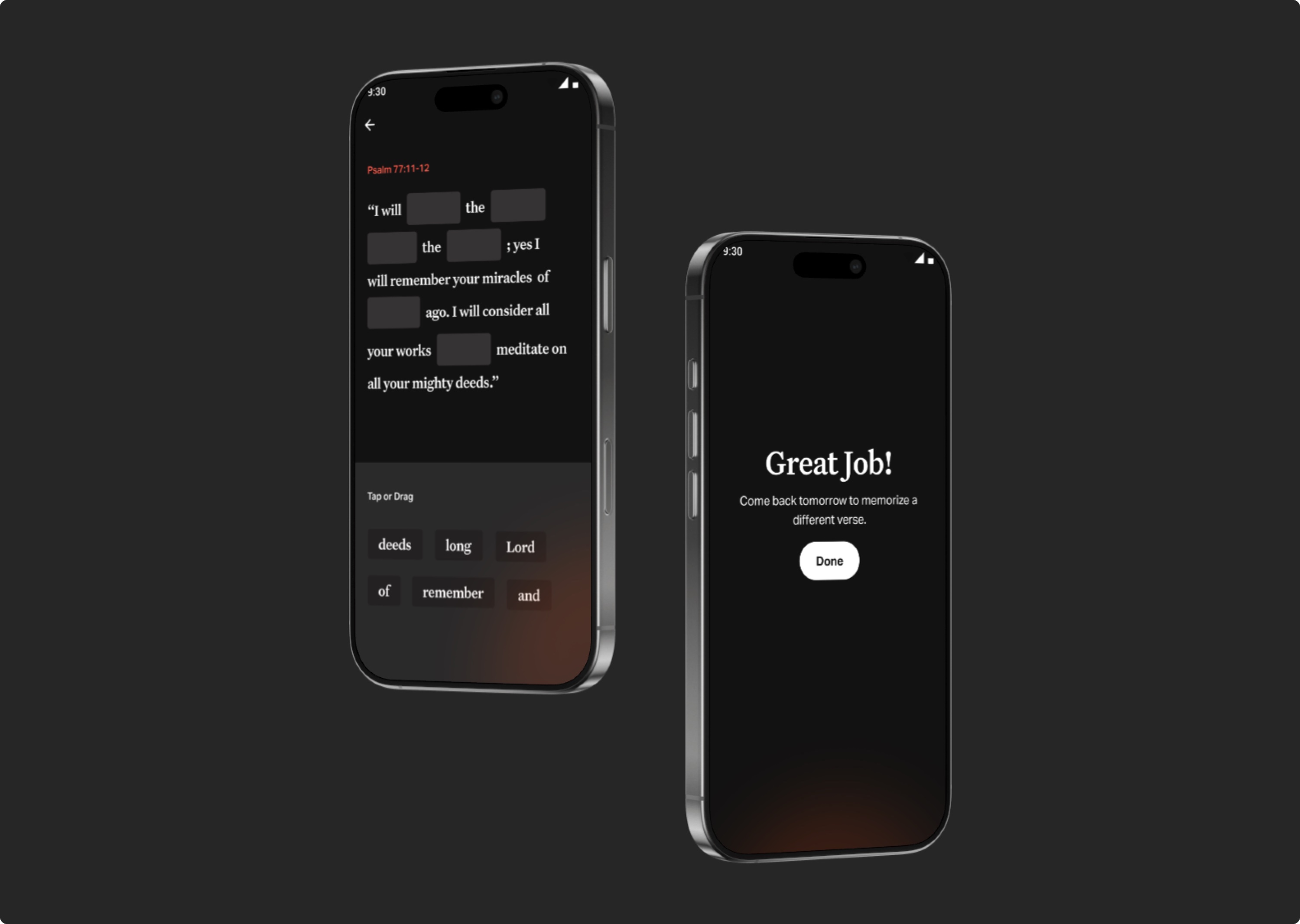
Memorization game: easy, fast, fun. Users who play show 83% higher Day-1 retention.
The simplest feature. The most loved.
One tap, tied directly to the verse. Users describe it as a door to start a conversation with God.
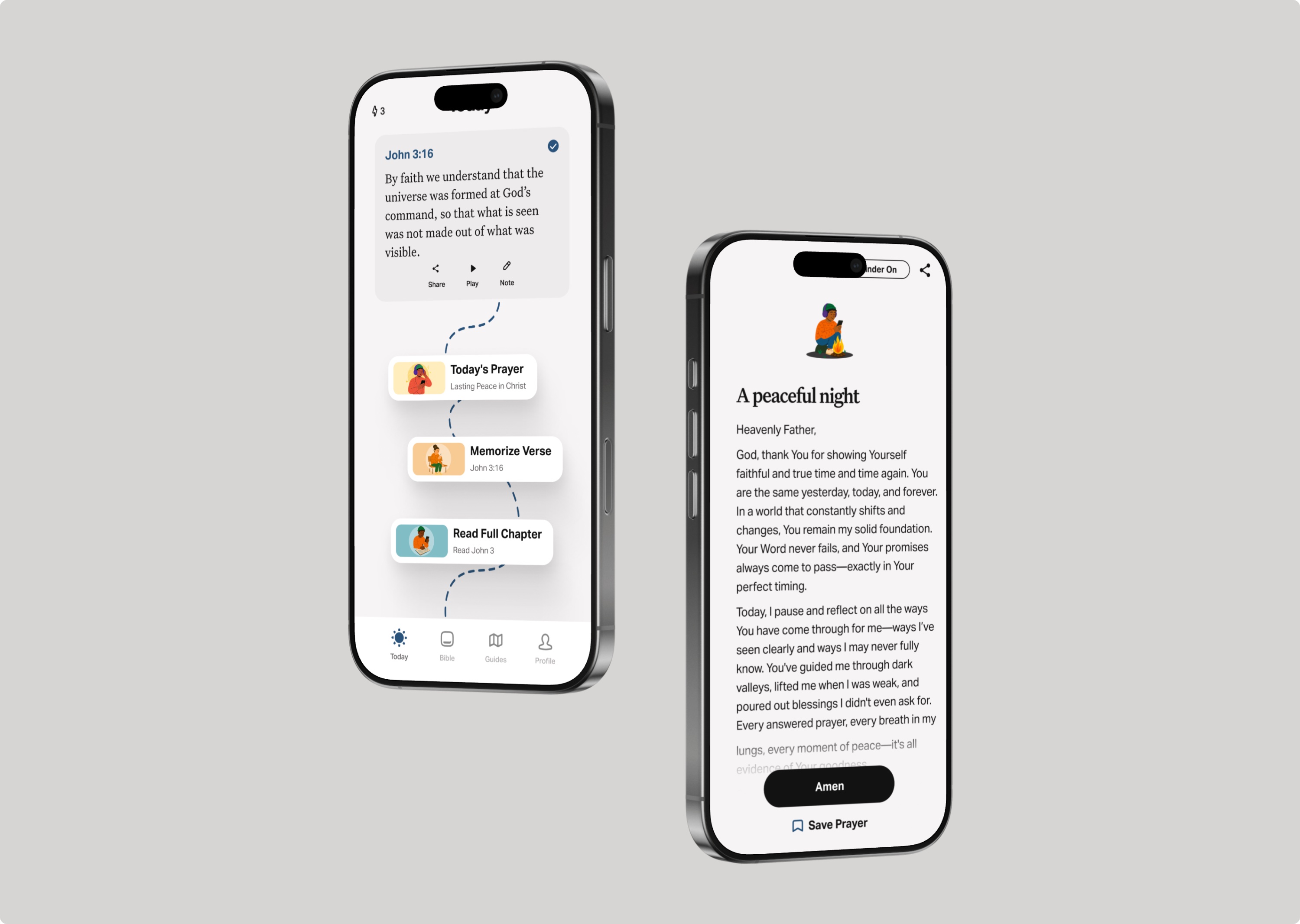
Prayer: one tap to start a conversation with God.
Outcome
55M+ installs. 192 countries. 300+ languages.
Bible App Lite launched as a test. It became a global product — a free, offline-ready path to daily Scripture for the people the full app couldn't reach.
"Since I downloaded Bible App Lite, I've been filled with joy and I've committed to serve God forever. It's helped me pray and hear from God's Word every day."
Ogar · Nigeria · Bible App Lite user